
The Digital Orchard: Modernizing a Chatswood Icon
In the competitive landscape of North Sydney’s hospitality sector, a digital presence must act as a seamless extension of the physical environment. The website for The Orchard Tavern serves as a premier case study in balancing heritage-listed gravitas with the fast-paced demands of modern “pub culture.” By utilizing a high-impact visual grid and a mobile-first information hierarchy, the design translates a century of history into a contemporary user experience.
Sensory Marketing and the “Hero” Strategy
The website immediately engages the user through sensory-driven imagery. The hero section—a macro shot of a condensation-filmed beer—is a deliberate choice in “appetite appeal” marketing. In web design for the food and beverage industry, the first three seconds of a visit are critical for establishing an emotional connection. By prioritizing high-definition, evocative photography of products (the beer and the burger) over static shots of an empty room, the site creates an immediate craving, driving the user toward the “Menu” or “Book Now” calls to action.
The Modular Grid: A Study in Navigation
Below the fold, the design transitions into a modular tile system. This is a strategic response to the “scrolling culture” of modern web users.
- Visual Shorthand: Each tile uses a specific iconographic image—dice for the VIP Lounge, a cocktail for “What’s On,” and a burger for the Menu. This allows users to navigate the site’s diverse offerings (from gaming to family dining) at a glance without reading dense blocks of text.
- Mobile-First Optimization: This grid layout is inherently responsive. On a desktop, it presents a sophisticated gallery; on a mobile device, these tiles stack vertically, creating large, “thumb-friendly” touch targets that reduce user frustration and bounce rates.
Strategic Information Architecture
For a neighborhood “local,” the primary goal of a website is utility. The Orchard Tavern’s layout adheres to the “Rule of Three” for restaurant ROI:
- Where are you? (The live Google Maps embed in the footer).
- Are you open? (Clear, tabular operating hours for every day of the week).
- What do you offer? (The prominent “Planning an Event?” section).
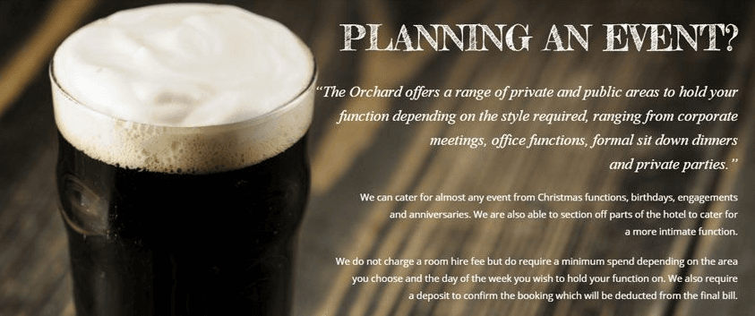
The “Planning an Event” block is particularly critical for a venue with five bars and a massive beer garden. By using a sophisticated serif font (“PLANNING AN EVENT?”) against a dark, moody background, the design signals that the tavern is more than just a place for a quick pint; it is a premium destination for corporate functions and formal celebrations.
Bridging the Art Deco Legacy
The Orchard Tavern (historically the Hotel Chatswood) was designed by the legendary architect Sidney Warden in the 1930s. While the website is modern, it pays homage to this “Art Deco” soul through its typography and color palette. The use of cream, gold, and deep charcoal mirrors the brass and timber textures found within the https://tailgaterstavern.com/ physical venue. This visual consistency ensures that when a guest walks through the doors in Chatswood, the physical reality matches the digital promise.
Conclusion: The User-Centric Pub
The Orchard Tavern’s website proves that a successful digital strategy for a historic venue doesn’t require reinventing the wheel—it requires clarity and atmosphere. By focusing on what the user needs (information) and what the user wants (a great vibe), the design ensures that this “Chatswood Original” remains relevant in a digital-first world.